Background
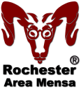
Sam the RAM has been abound for at least 14 or 15 years and has gone through a formal approval process to achieve approval and recognition from AML. The best information available now is that AML approval was conferred in 2011. Luckily for us, Sam is a superior being of great patience (and affable intelligence, according to the numerous survey inquiries prior to submission for approval), and is only now being put to work.
Rochester Area Mensa → "RAM" → Sam the RAM
Qualities and Characteristics
This is mostly FYI, but quite a bit is considered in the making of a logo; Sam fits very well with most contemporary logotype conventions. Here are several lists of important qualities and characteristics every good logo should have, gathered from various sources all around the web:
Five Characteristics of a Great Logo
- Simple
Simple logos are the ones people can recognize as soon as they see them. The simplest logos are the ones people remember the most.
- Scalable
A great logo should be simple enough to be able to be scaled down or up and still look good.
- Memorable / Impactful
A great logo should be impactful. You want to capture your viewer's attentions and leave an impression (a positive impression, hopefully).
- Versatile
A great logo should look equally good on any web device and on any kind of print material.
- Relevant
A great logo should be relevant to your practice. It has to have meaning that relates to the work you are doing.
10 Questions to ask yourself
(about 3/4 of the way down the page)
Here are ten questions to ask to make yourself sure that your logo is effective:
- Is the logo relevant to the business we operate?
- Is the logo appropriate? (make sure that your logo does not carry an unintended message as in these examples) and Does the logo communicate the right style and tone?
- Is the logo simple?
- Does the logo carry one message at most?
- Is the logo unique and distinctive? (please, google overused logos)
- Is the logo readable, recognizable and memorable?
- Would the logo still be relevant and effective in one year and in five years?
- Is the main feature of the logo being trendy? (if yes consider redesign)
- Is the logo scalable without loosing the carried message?
- Does the logo work good in colours as well as in black and white?
7 Essential Qualities of a Great Logo
- Simple.
DO streamline your design. DON'T overcomplicate things.
- Distinct.
DO set yourself apart. DON'T look just like the competition.
- Versatile.
DO consider various applications. DON'T design for just one size or medium.
- Appropriate.
DO think about your industry. DON'T feel the need to be obvious.
- Targeted.
DO design for your intended audience. DON'T forget the customer.
- Memorable.
DON'T be forgettable. DO leave an impression.
- Timeless.
DON'T be too trendy. DO aim for longevity.
An appropriate style choice
(contained within #2 of the list)
Style choice is one of the first logo design decisions to consider. Here's a quick run-down on the five types of logo styles to help you find your way.
Wordmarks - A wordmark is a logo made up exclusively of text
Brandmarks - depict your brand without words, through the use of an image or symbol
Combination marks - flexibility to spell out the company name while also incorporating an image or symbol
Emblems - emblems incorporate both text and an icon or symbol, usually by designing text inside the symbol
Lettermarks - initial or monogram-style logos
Appropriate colour combination
(marked "Fourth," 2/3 down the page)
Let's break down the psychological meaning of colours from The Psychology of Colour in Logo Design.
- Red: Exciting, Sexy and Urgent
- Blue: Strength, Dependability & tranquillity
- Green: Peace & Growth
- Yellow: Optimistic, Clarity and Warm
- Orange: Creative, Youthful and Enthusiastic
- Purple: Spiritual, Royalty & Beauty
- Black: Professional & Credible
- White: Clean & Pure


